
Discord Mobile App Redesign
Overview:
Discord is a popular and expanding platform for virtual communications. As a service, it offers a large array of features and customizable settings for its users. The mobile application packs in a lot of these services as well and my team was tasked with performing an analysis to determine what- if any -changes might be made to its design to improve usability.
Through the use of surveys and usability testing on both new and seasoned members of the mobile application, we determined that there was a steep learning curve for new users due to confusing navigation that bucked established conventions. We determined to redesign core elements of the navigation to make popular user tasks more intuitive and streamlined for a mobile experience.
The Challenge:
There were a few challenges that presented themselves as we began this process.
The first being that Discord has a growing user base that represents interests outside of its core group of gamers. We needed to find a way to make revisions to the mobile application that made it more approachable for these new users without creating changes so drastic that they would frustrate users who had been with the mobile application for longer.
The second challenge was that many users valued the mobile application for offering almost all of the same features that the desktop version has. The difficulty though was that the wide array of features and setting were a significant part of why the navigation was so complex in the first place. We needed to figure out a way to decrease the learning curve for new users without sacrificing any of the features that Discord members value.
Discovery
Role and Duration:
Research and Design
surveys, usability testing, user interviews, affinity mapping, persona development, comparative analysis, wire framing, prototyping
Team: 4 Designers
Duration: 2 week sprint January 2021
We had an initial hypothesis that the mobile application might have some usability issues because it is modeled so closely after the desktop version and is not optimized for smaller screens. We weren't sure though and decided we should start off with asking Discord users what their experiences were like using the mobile application.
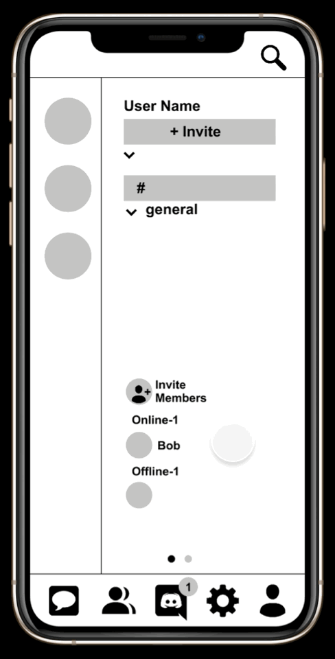
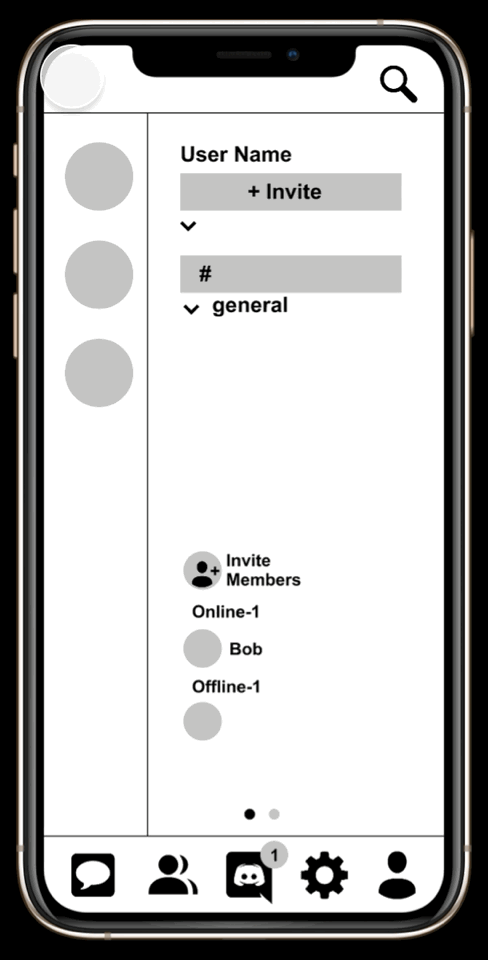
You can see below that the organization of the mobile app is very similar to the desktop version. The three main areas for navigation have been separated into individual screens on the mobile version.
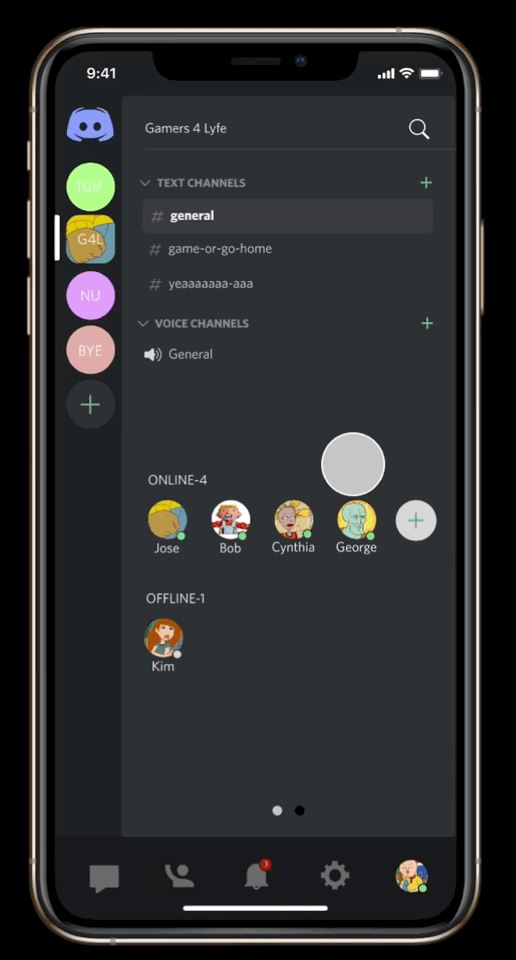
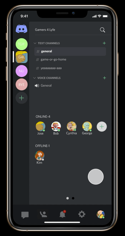
Discord's desktop application
Discord's mobile application
Servers & channels
Channel feed
Users

Servers & channels

Channel feed

Users

User Surveys
To test our hypothesis we created a survey asking users what their experiences are like using Discord. Some of the questions we asked were:
-
How long have you been using the discord mobile app?
-
What do you use Discord for?
-
What communities interest you the most?
-
How would you rate the learnability?
-
What do you find intuitive about the mobile application?
-
What struggles do you have with the mobile application?
From these surveys I found that the responses showed many users were experiencing stumbles at some point or another with navigation. which is highlighted in yellow below.

I was able to uncover data about what communities our users are drawn to. I saw that gaming is the largest group but there are many other growing communities as well that need to be considered.

I was also able to organize data around what features our users were interacting with the most and the learnability of the mobile application.


Usability Testing
I found that our surveys were filled out by Discord users who had been on the mobile application for over a year. I decided it would be helpful to see first-hand what brand-new users experienced when trying to use the application for the first time. I put together tasks based on the most common things a user would typically need to do.
We found that every users had stumbles with settings, screen sharing, and direct messaging.

This user spent over five minutes trying to locate the screen share feature
Affinity Map
Our affinity map included quotes from our survey and our usability testing. We found that the largest area of overlap between users was in expressing some difficulty with navigation.


Heuristic Comparison
I decided to do a heuristic comparison between the desktop version of the application and the mobile application. In our surveys, users had indicated finding the desktop app easy to use and intuitive. The main takeaway I had was that the desktop app gives users access to every feature on the same screen. The mobile app does not do this, causing users to need to swipe and tap around in order to access frequently used features.

Personas
My team took the data I visualized and used it to create two personas: Vincent represents the majority of current Discord users and Emma represents the growing audience that Discord is focused on expanding. We mapped their goals and frustrations to the largest areas of overlap in our affinity map. I then began creating task flows based on that information.


User Task Flows
I mapped out the current user flows for the tasks that aligned with our persona's pain points and redesigned them to be less complicated.
Original Flows
New Flows


Wire Framing
I drew up wireframes with initial ideas of how to reorganize icons to fit the abbreviated user flows and to be more aligned with established conventions. I did this by:
-
including a notifications icon on the main screen
-
creating a global navigation bar
-
including global search bar in top right corner of screen
-
moving the direct messaging icon on to the global navigation bar
-
moving user information from 3rd screen onto the main screen
-
consolidating all settings menus into one menu located in the global navigation bar


Once we finished our design we prototyped for the tasks our original users performed for the first round of usability testing.
Testing
Our first round of testing was with users who had never used Discord before. They demonstrated usability problems such as:
-
user wasn't sure they had to go to channel to mute their notification
-
user thought notifications would be under a bell icon
-
user thought muting notifications would be under settings
-
user clicked pin icon to pin messages instead of clicking the message to pin
-
user was not sure they completed "change moderation settings" task because there was no indication it was saved
Pin George's message in the general channel
Change moderation settings to medium
High Fidelity Prototype And Testing
We took the feedback from our first round of testing and made edits to our layout, symbols, and visual feedback. Some of the edits made were:
I provided visual feedback in the task for changing moderation settings.

changed the notifications icon to a bell and created a home screen button in the top left corner of the screen, as well as put notification settings in the notifications pop-up screen

provided text below the icons for messaging, calling, video, and screen sharing

We also found that when we went back through the original data that we had missed a big pain point about direct messaging and decided to prototype a new flow for this task


Next Steps
We found that after our third round of usability tests were done we still had work to do. With the available data I have some suggestions for things we can do moving forward:
Design & Layout
-
Redesign the screen share icon - users were confused what the icon meant
-
Consider adding a mute icon to the home screen - users had issues finding how to mute the channel
-
Address additional notification settings in notifications screen - would it be intuitive for users to edit their notifications both from the notifications screen and also in the main settings?
-
Add symbols or allowances for navigating to channel feed screen - users weren't always sure to swipe over to that screen
Research
-
Perform targeted surveys of users who represent more specific communities on Discord
-
Create a journey map with the current iteration of the prototype as well as Discord Mobile
-
Perform A/B testing with the prototype and Discord Mobile
-
Expand usability testing and focus on specific user communities for comparison
-
Determine how best to gauge success and how to effectively present it
My Thoughts
This project was exciting and challenging. I found that it was satisfying to uncover potential improvements for Discord Mobile. I think the biggest challenge was uncovering the right questions to ask, and by the end of the two week period I feel like I was just starting to realize some of the initial mistakes I had made and how I could have been more efficient with my research. I do think that my team found real and specific usability concerns with the navigation. It would require more research to determine if our solutions are on the right track though. I am excited to continue with this project in the future to see where our questions lead us. I genuinely enjoy Discord and am grateful that I was able to use the platform to learn and improve in my work.
