NFL Super Bowl Slots
NFL Super Bowl Slots
Designing and testing wireframes for a brand-new mobile game.

overview
My company started developing a mobile casino game in collaboration with a major IP. As the lead UX designer, I was assigned the task of bringing everyone's ideas together and developing the new UI and navigation model for a virtual slot app. The main lobby and Slot HUDs play a crucial role in determining both early and long-term user retention.
my contributions
I worked as the sole UX designer on this project. I was responsible for working directly with leadership across disciplines and provided:
UX strategy based on findings from consumer insights (UX research)
design recommendations based on heuristics analysis
feature recommendations informed by comparative studies
user flows and wireframes
project goals
Lean on industry standards and user testing to validate design decisions in order to create the main lobby of a new mobile slot game where the core MVP features of the game will be located.
getting started
I began by meeting with stakeholders and team members to understand the market and its users, as well as the core loop proposed by the leadership. It became apparent that there was an immediate need to define the information architecture of our game. Specifically, we needed to begin that process by tackling the main lobby.
whats going in the game?
I started taking inventory of what features were planned to go into the game. I set up meetings with our Sr.Director of Game Design and VP of Product to discuss their priorities as they related to the core game loop.
I found that there were six must have features for MVP.
missions
Side missions and quests add additional goals to increase user motivation, which resulted in improved retentions.
battle pass
rewards milestones to help track users' progression.
collections
Users find high-value memorandums themed around our exciting IP.
daily bonus
A standard feature across all mobile casino games that provides users an allowance of coins
store
Key feature for any free to play mobile game
promotions
Product driven sales that tie into the store and live ops
mvp features
Once I understood what features were key, I decided to perform a competitive analysis using games from our portfolio and games that were major competitors in the space.
Competitive Analysis
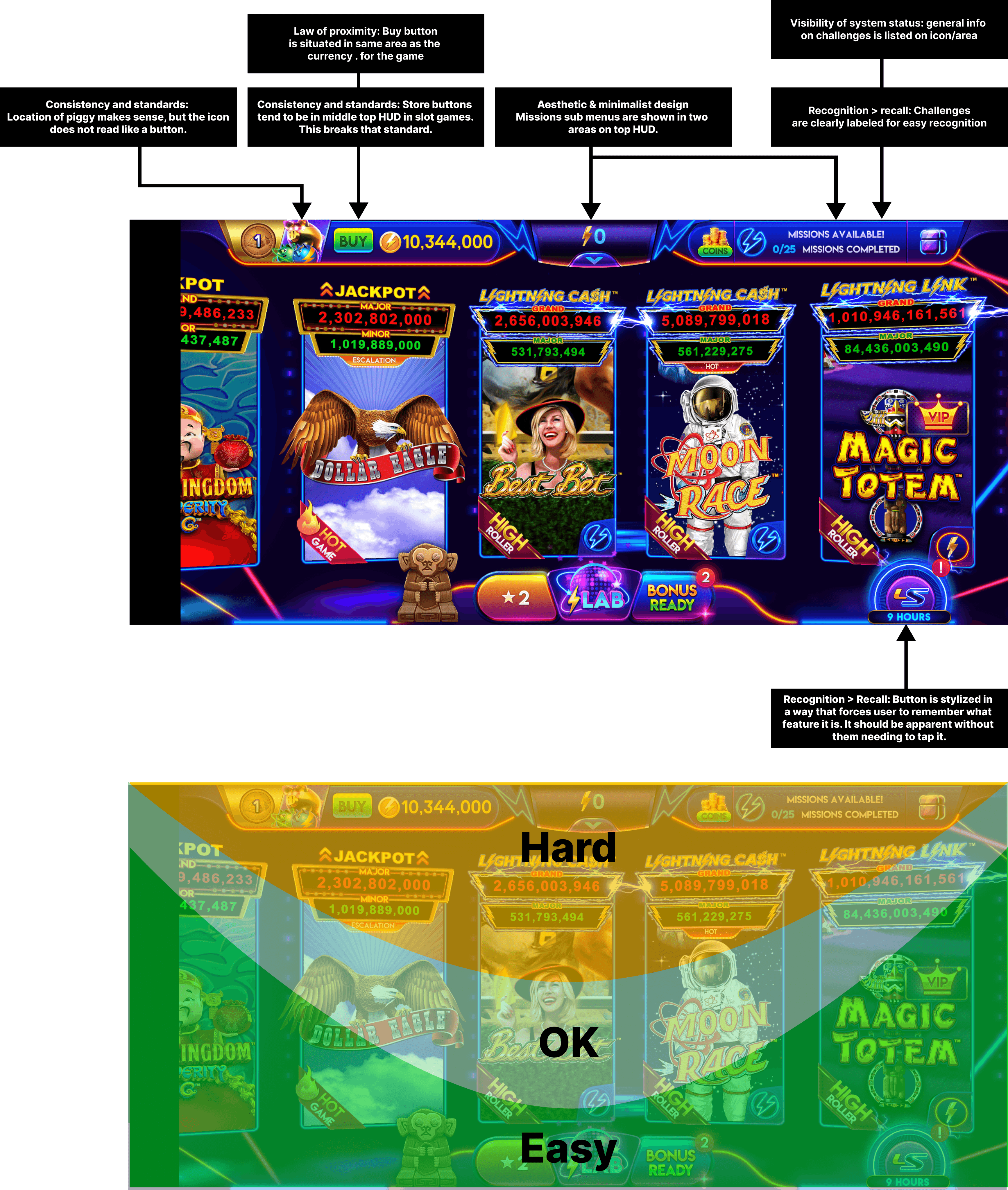
Key Takeaways
Space Management and Layout:
Efficient use of space for features and store offerings ensures a non-overwhelming, simple layout.
Related features are closely positioned, similar to successful interfaces like Cash Frenzy, with core functionalities centralized on two heads-up displays (HUDs).
Design and Feature Layout:
Redundant navigation elements and complex sub-menus create confusion and impair navigation efficiency.
Consistent feature layouts, such as the Slots Filter System, help users navigate more intuitively. However, small tiles limit the information display, affecting user comprehension.
Touch Points and Accessibility:
Critical features like the wheel, daily, and hourly bonuses are easily accessible.
The expandable tray feature enhances ease of access to various functionalities.
Less accessible components include the store, profile, and missions, highlighting a need for better accessibility in these areas.
Icon Design and User Recognition:
Consistent labeling of icons and badges on slot tiles improves recognition and user experience.
However, inconsistent icon designs across different features can hinder functionality and user interaction.
Overall User Experience:
There is a notable disparity in the accessibility of features, with some like the piggy bank and retention features being more user-friendly than others such as the store and profile options.
Enhancing label clarity and simplifying navigation could significantly improve overall user experience and feature engagement.
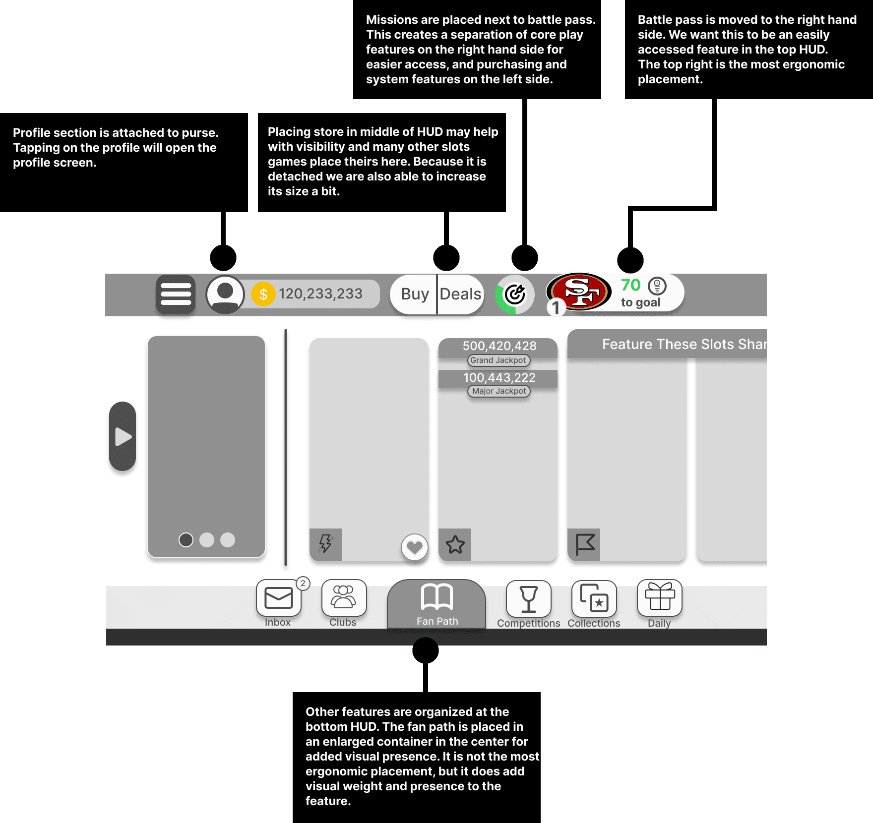
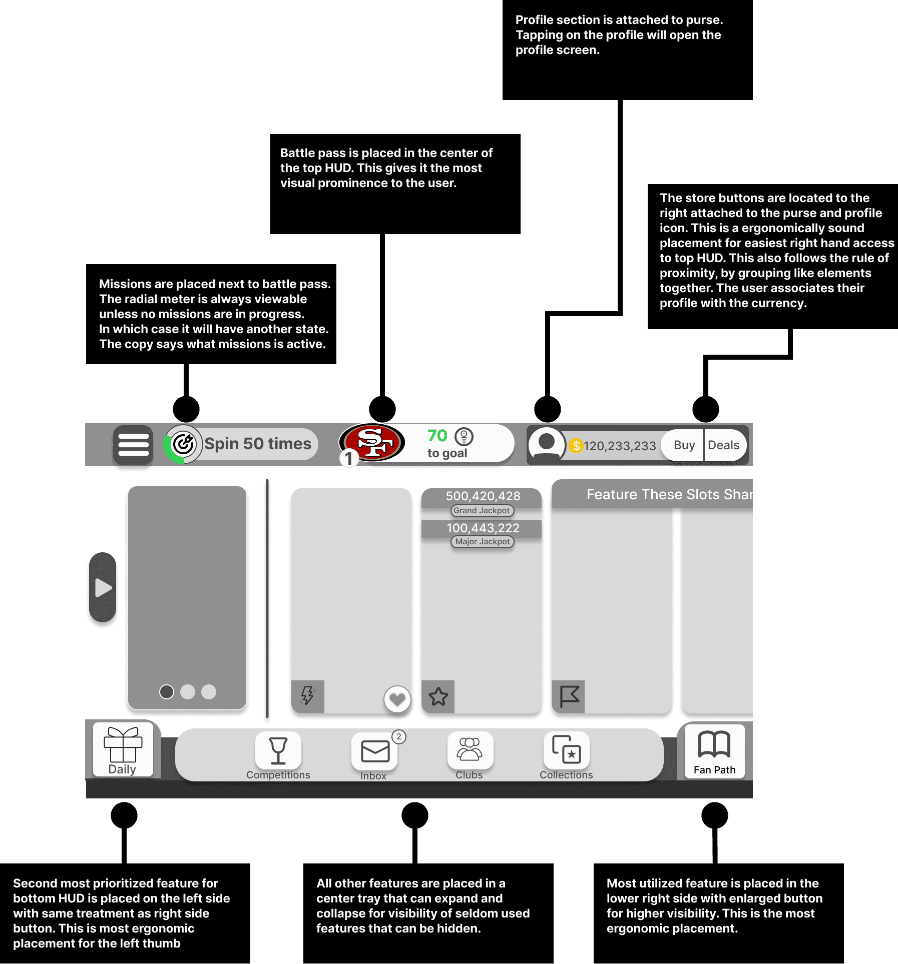
The team saw significant potential with each of the proposals above. After engaging in discussions with stakeholders and user researchers, we narrowed down to two designs that we could present to our users for usability testing and research. To add context for users I created additional screens demonstrating settings menus and the slot gameplay screen.
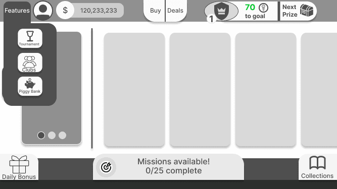
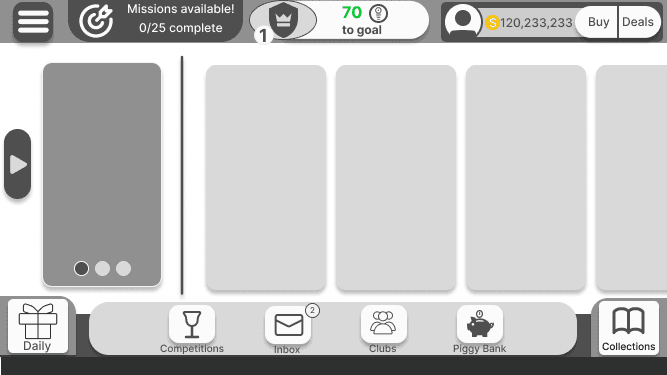
I had two design approaches for the lobby and both seemed viable. One was to adopt a method similar to Cash Frenzy and use a central tray to house all secondary features and live-ops. This would help with scalability in the future. The second was to highlight our missions, which were going to be the main retention feature for the title.
getting the team involved
option 2: missions focused
option 1: scalability
For our testing, we wanted to focus on recognition and user sentiment towards the design. We asked a combination of open-ended questions about sentiment and expectations and questions about what they would expect certain elements to do or where they would expect features to be located.
testing
We tested 10 participants who were mobile casino players between the ages of 27 and 52. Their response was overwhelmingly in favor of the first option. However there were certain design decisions about option two they appreciated. The main take aways are as follow:
results
Sample of questions asked in user tests:
General Layout and Design
Overall Impression: "What are your initial thoughts about the layout and design of this screen?"
Element Placement: "How do you feel about the placement of buttons and features on the screen? Is there anything that feels out of place or hard to find?"
Design Appeal: "What do you find most visually appealing about this interface, and why?"
Specific Elements
Mission Button: "Where would you expect to find tasks to perform to earn rewards? How easy was it to locate?"
Collections: "Where would you expect to find things you've earned as you progress in the game? How confident are you in your answer?"
Daily Bonus: "Where would you expect to find free coins?"
Store Button: "How does the store button appear to you in terms of visibility and accessibility?"
Hamburger Menu: "What are your expectations when you see the hamburger menu?
What would you expect to see in buttons X,Y, Z?
User Experience and Sentiment
Icon Recognition: "Were there any icons or buttons whose function was not immediately clear to you?"
Layout Preferences: "If you could change anything about the layout or size of these elements, what would it be and why?"
User Expectation: "Did anything in the layout behave differently than you expected? If so, what was it and how did it differ from your expectation?"
Overall Feedback
Improvement Suggestions: "What improvements or changes would you suggest for this interface?"
Final Thoughts: "Do you have any other thoughts or feedback about the design that you would like to share?"
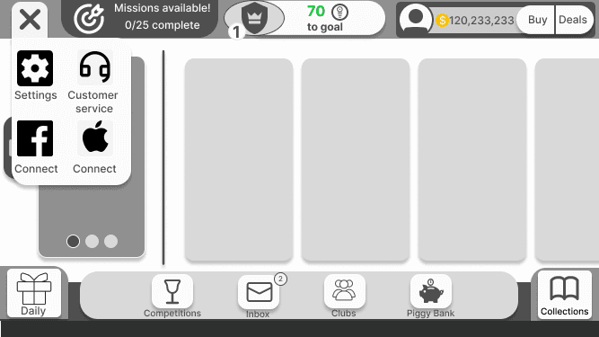
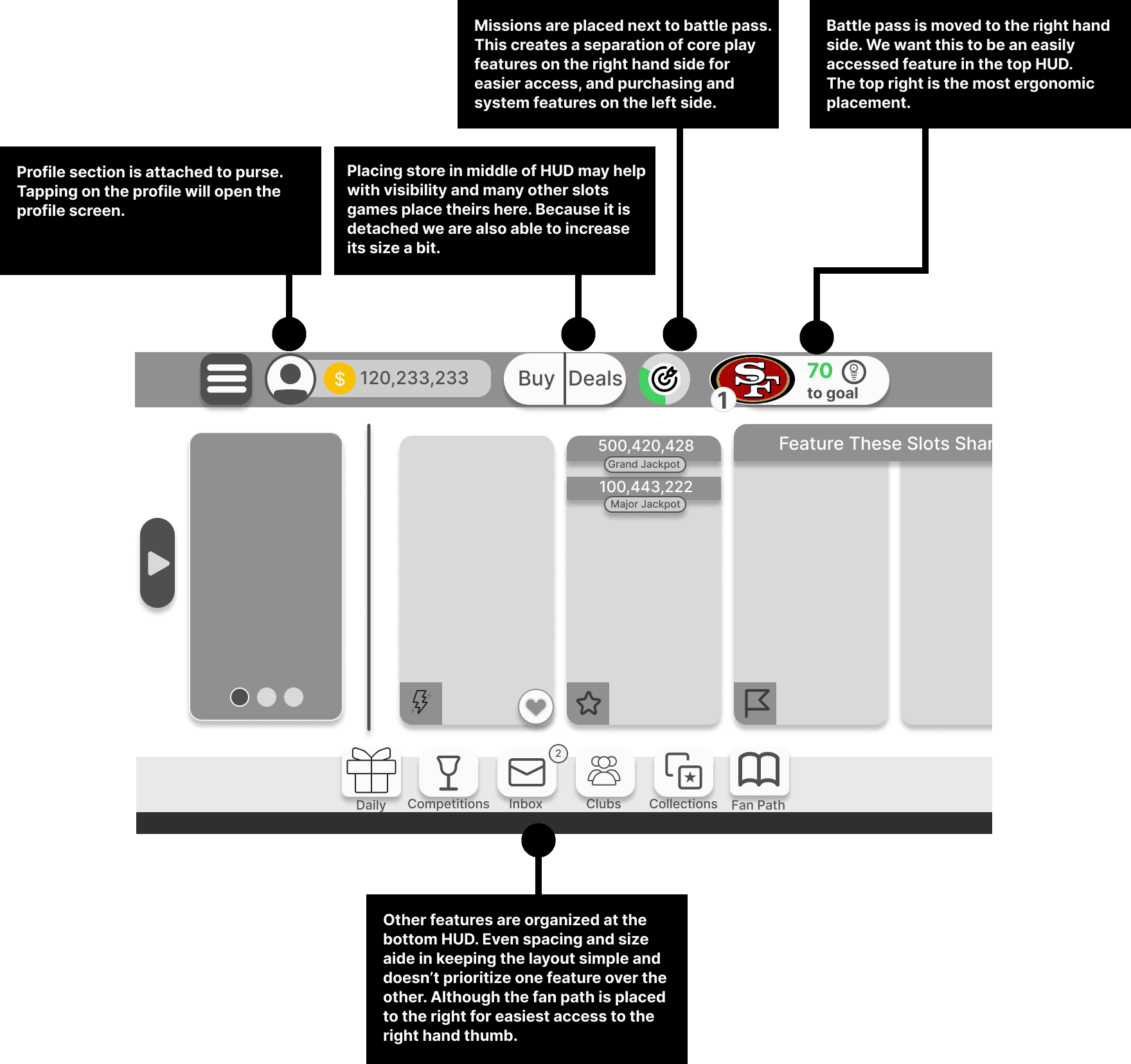
social & profile together
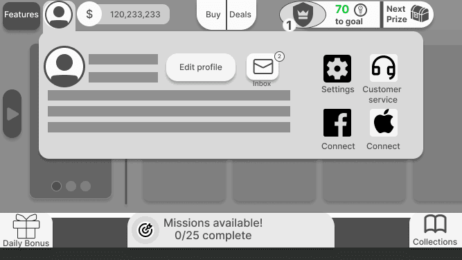
Users much preferred the profile screen on the second option. They felt social, mail, and settings made sense there.
don’t cover slots space
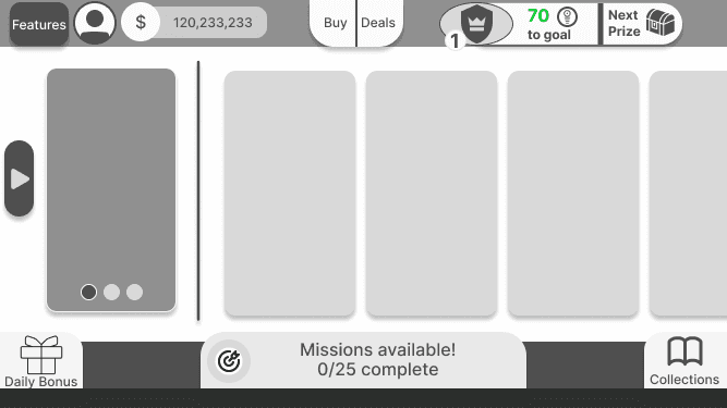
Users all responded negatively to the missions asset being placed over the slot area.
no large mission icon
Users felt that having a huge missions asset in the middle at the bottom was odd and made the game seem one dimensional.
keep features visible
Users much preferred option one because they could see everything all at once.
mission consistency
User's preferred option one because the missions asset stayed in the top HUD in lobby and slots play.
make info easy to find
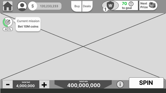
Users made it clear that they all liked the information icon on the slot bottom HUD.
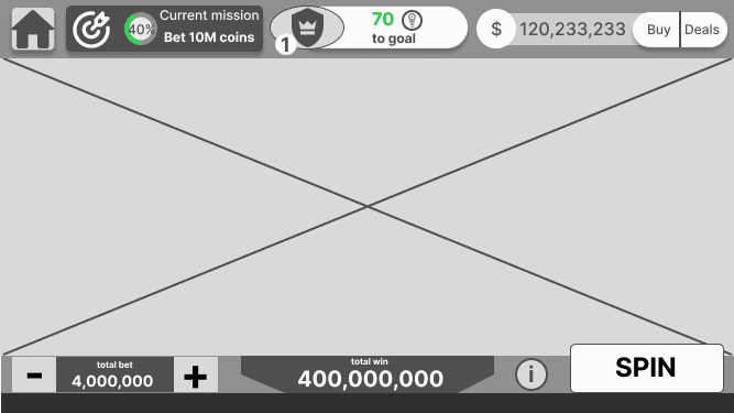
We were working simultaneously to run testing and iterate designs while also making higher-fidelity mock-ups to provide proof of concept to executives. I created a prototype with this feedback in mind that captured the app launch sequence. I also created a high-fidelity prototype in collaboration with the art team to demonstrate visuals and branding.
lobby prototype
User Interface and Layout
Streamlined Navigation: Develop a straightforward and intuitive navigation system. Avoid overly complex sub-menu structures to enhance user experience.
Clear Layout: Emphasize simplicity in the game's layout, making sure it's visually appealing yet not overwhelming, similar to the successful approach of Heart of Vegas.
Feature Organization and Accessibility
Strategic Feature Placement: Prioritize the placement of key features like missions, stores, and bonuses within easy reach, considering thumb-friendly zones for mobile users.
Compartmentalization of Features: Group related features effectively, as seen in Lightning Link, but ensure that each feature is distinct and easily identifiable.
Design and Aesthetics
Consistent Iconography: Design icons that are both visually consistent and clearly convey their function. This addresses the inconsistency issue observed in Heart of Vegas.
Differentiation of Interactive Elements: Ensure buttons and interactive elements are distinctly designed, addressing the differentiation issue seen in Lightning Link.
User Engagement and Retention
Optimized Touch Points: Design the game's touch points—such as the missions, bonuses, and battle pass features—to be easily accessible, drawing from the successful elements in Cashman and Cash Frenzy.
Additional Considerations
Avoid Redundancy: Eliminate redundant navigation elements to reduce confusion and streamline user experience, learning from the issues identified in Cash Frenzy.
Ergonomic Design: Focus on ergonomic considerations, ensuring that the features we want to prioritize are in the most visible and easy to reach places.
Filter and Sorting Features: Incorporate an effective filter system for slots, improving on the execution seen in Slotomania, ensuring that the icons used are appropriate and intuitive.
Recommendations

Designing Early information architecture for Nfl game
my contributions
I worked as the sole UX designer on this project. I was responsible for working directly with leadership across disciplines and provided:
UX strategy based on findings from consumer insights (UX research)
Design recommendations based on heuristics analysis
Feature recommendations informed by comparative studies
User flows and wireframes
overview
My company started developing a mobile casino game in collaboration with a major IP. As the lead UX designer, I was assigned the task of bringing everyone's ideas together and developing the new UI and navigation model for a virtual slot app. The main lobby and Slot Heads Up Displays (HUDs) play a crucial role in determining both early and long-term user retention.
project goals
Lean on industry standards and user testing to validate design decisions in order to create the main lobby of a new mobile slot game where the core MVP features of the game will be located.
getting started
I began by meeting with stakeholders and team members to understand the market and its users, as well as the core loop proposed by the leadership. It became apparent that there was an immediate need to define the information architecture of our game. Specifically, we needed to begin that process by tackling the main lobby.
what's going in the game?
I started taking inventory of what features were planned to go into the game. I set up meetings with our Sr. Director of Game Design and VP of Product to discuss their priorities as they related to the core game loop.
I found that there were six must-have features for MVP.
mvp features
missions
Side missions and quests add additional goals to increase user motivation, which resulted in improved retentions
battle pass
Rewards milestones to help track user progression
collections
Users find high-value memorandums themed around our exciting IP
daily bonus
A standard feature across all mobile casino games that provides users an allowance of coins
store
A key feature for any free to play mobile game
promotions
Product driven sales that tie into the store and live ops
Competitive Analysis
Once I understood what features were key, I decided to perform a competitive analysis using games from our portfolio and games that were major competitors in the space.
Key Takeaways
Space Management and Layout:
Efficient use of space for features and store offerings ensures a non-overwhelming, simple layout.
Related features are closely positioned, similar to successful interfaces like Cash Frenzy, with core functionalities centralized on two HUDs.
Design and Feature Layout:
Redundant navigation elements and complex sub-menus create confusion and impair navigation efficiency.
Consistent feature layouts, such as the Slots Filter System, help users navigate more intuitively. However, small tiles limit the information display, affecting user comprehension.
Touch Points and Accessibility:
Critical features like the wheel, daily, and hourly bonuses are easily accessible.
The expandable tray feature enhances ease of access to various functionalities.
Less accessible components include the store, profile, and missions, highlighting a need for better accessibility in these areas.
Icon Design and User Recognition:
Consistent labeling of icons and badges on slot tiles improves recognition and user experience.
However, inconsistent icon designs across different features can hinder functionality and user interaction.
Overall User Experience:
There is a notable disparity in the accessibility of features, with some like the piggy bank and retention features being more user-friendly than others such as the store and profile options.
Enhancing label clarity and simplifying navigation could significantly improve overall user experience and feature engagement.
Recommendations
Feature Organization and Accessibility
Strategic Feature Placement: Prioritize the placement of key features like missions, stores, and bonuses within easy reach, considering thumb-friendly zones for mobile users.
Compartmentalization of Features: Group related features effectively, as seen in Lightning Link, but ensure that each feature is distinct and easily identifiable.
Design and Aesthetics
Differentiation of Interactive Elements: Ensure buttons and interactive elements are distinctly designed, addressing the differentiation issue seen in Lightning Link.
User Engagement and Retention
Optimized Touch Points: Design the game's touch points—such as the missions, bonuses, and battle pass features—to be easily accessible, drawing from the successful elements in Cashman and Cash Frenzy.
Additional Considerations
Avoid Redundancy: Eliminate redundant navigation elements to reduce confusion and streamline user experience, learning from the issues identified in Cash Frenzy.
Ergonomic Design: Focus on ergonomic considerations, ensuring that the features we want to prioritize are in the most visible and easy to reach places.
Filter and Sorting Features: Incorporate an effective filter system for slots, improving on the execution seen in Slotomania, ensuring that the icons used are appropriate and intuitive.
designs
I created 4 designs based on these observations.
getting the team involved
The team saw significant potential with each of the proposals above. After engaging in discussions with stakeholders and user researchers, we narrowed down to two designs that we could present to our users for usability testing and research. To add context for users I created additional screens demonstrating settings menus and the slot gameplay screen.
I had two design approaches for the lobby and both seemed viable. One was to adopt a method similar to Cash Frenzy and use a central tray to house all secondary features and live-ops. This would help with scalability in the future. The second was to highlight our missions, which were going to be the main retention feature for the title.
option 1: scalability
option 2: missions focused
testing
For our testing, we wanted to focus on recognition and user sentiment towards the design. We asked a combination of open-ended questions about sentiment and expectations and questions about what they would expect certain elements to do or where they would expect features to be located.
Sample of questions asked in user tests:
General Layout and Design
Overall Impression: "What are your initial thoughts about the layout and design of this screen?"
Element Placement: "How do you feel about the placement of buttons and features on the screen? Is there anything that feels out of place or hard to find?"
Design Appeal: "What do you find most visually appealing about this interface, and why?"
Specific Elements
Mission Button: "Where would you expect to find tasks to perform to earn rewards? How easy was it to locate?"
Collections: "Where would you expect to find things you've earned as you progress in the game? How confident are you in your answer?"
Daily Bonus: "Where would you expect to find free coins?"
Store Button: "How does the store button appear to you in terms of visibility and accessibility?"
Hamburger Menu: "What are your expectations when you see the hamburger menu?"
"What would you expect to see in buttons X,Y, Z?"
User Experience and Sentiment
Icon Recognition: "Were there any icons or buttons whose function was not immediately clear to you?"
Layout Preferences: "If you could change anything about the layout or size of these elements, what would it be and why?"
User Expectation: "Did anything in the layout behave differently than you expected? If so, what was it and how did it differ from your expectation?"
Overall Feedback
Improvement Suggestions: "What improvements or changes would you suggest for this interface?"
Final Thoughts: "Do you have any other thoughts or feedback about the design that you would like to share?"
results
We tested 10 participants who were mobile casino players between the ages of 27 and 52. Their response was overwhelmingly in favor of the first option. However there were certain design decisions about option two they appreciated. The main take aways are as follow:
keep features visible
Users much preferred option one because they could see everything all at once.
mission consistency
User's preferred option one because the missions asset stayed in the top HUD in lobby and slots play.
make info easy to find
Users made it clear that they all liked the information icon on the slot bottom HUD.
social & profile together
Users much preferred the profile screen on the second option. They felt social, mail, and settings made sense there.
don’t cover slots space
Users all responded negatively to the missions asset being placed over the slot area.
no large mission icon
Users felt that having a huge missions asset in the middle at the bottom was odd and made the game seem one dimensional.
lobby prototype
We were working simultaneously to run testing and iterate designs while also making higher fidelity mock-ups to provide proof of concept to executives. I created a prototype with this feedback in mind that captured the app launch sequence. I also created a high-fidelity prototype in collaboration with the art team to demonstrate visuals and branding.