Porter Member Portal Redesign
Transforming a fragmented portal into a guided, AI-supported experience
the challenge
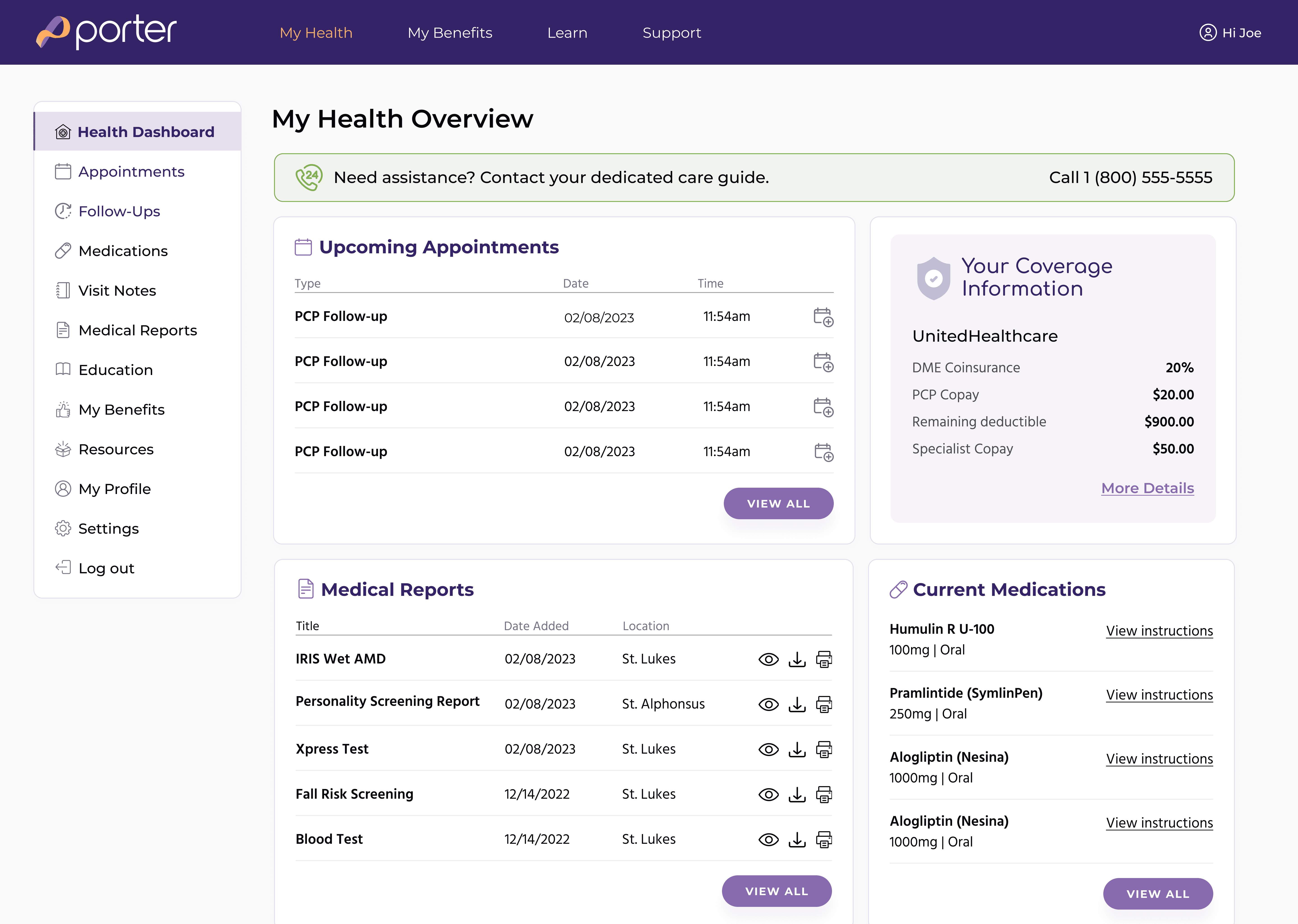
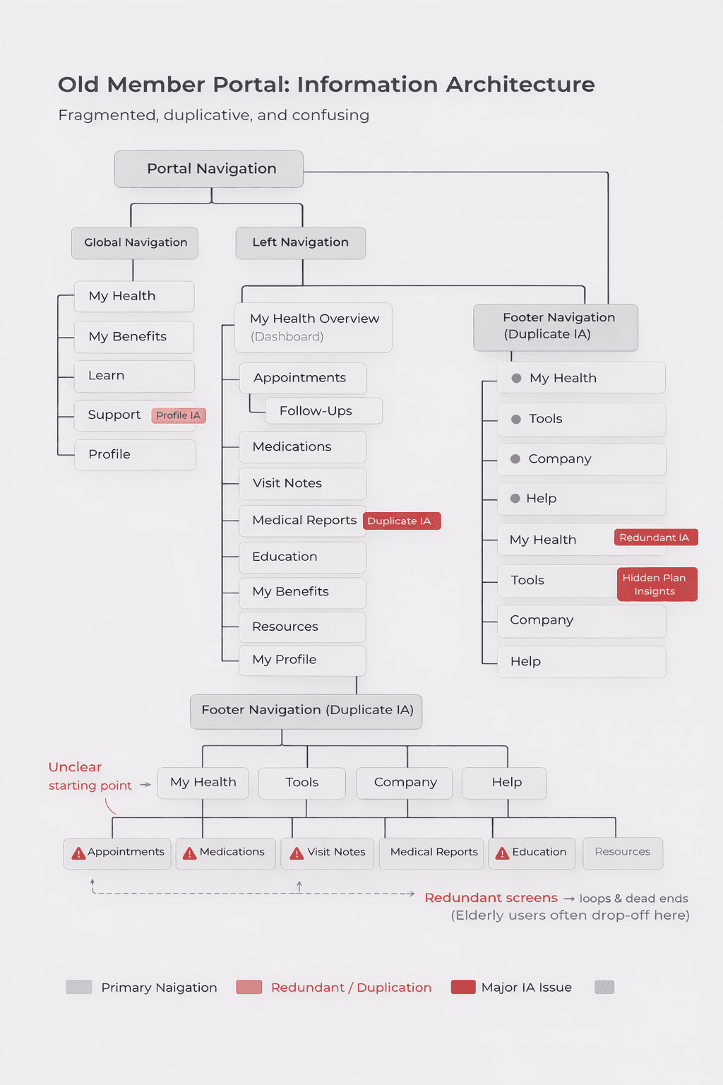
The original experience suffered from fundamental service design issues:
No clear starting point
Low digital literacy among members
Insurance information written at a technical level
Porter Plan insights not visible or actionable
Redundant screens causing loops and dead ends
Severe onboarding drop-off (98%)
Care guides were compensating with manual support because the portal did not help members understand their benefits or next steps.
This wasn’t just a UX issue — it was a breakdown across the member journey, service workflow, and information architecture.
Research & Discovery
Discovery Approach
Direct member interviews weren’t available, so I grounded discovery in operational reality and behavioral data.
Care Guide & Leadership Interviews
Surfaced repeated member questions, friction points, and payer expectations.
Behavioral Analytics (Mixpanel)
I designed and implemented the full tracking plan with engineering, revealing a 98% onboarding drop-off, unreachable screens, navigation loops, and coverage-driven support spikes.
Service & Workflow Mapping
Mapped the end-to-end system from member → portal → care guide → provider → payer to identify where the experience was breaking down.
Together, these inputs were sufficient to define a clear redesign strategy without direct member interviews.
Key Insight: Members Needed Direction.
Older adults weren’t trying to explore a product. They were trying to understand their care.
They wanted to know what was covered, what to do next, and where to get help. The Porter Plan already contained that information, but it wasn’t presented in a way members could easily understand or act on.
The redesign focused on surfacing those recommendations clearly and putting them in front of members as concrete next steps.
Design Strategy
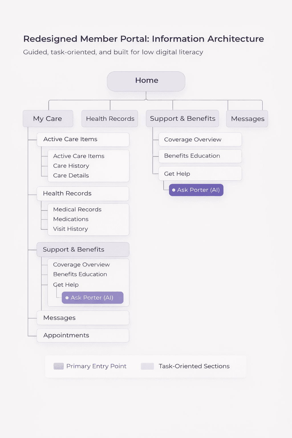
1 Create a Clear, Guided Starting Point
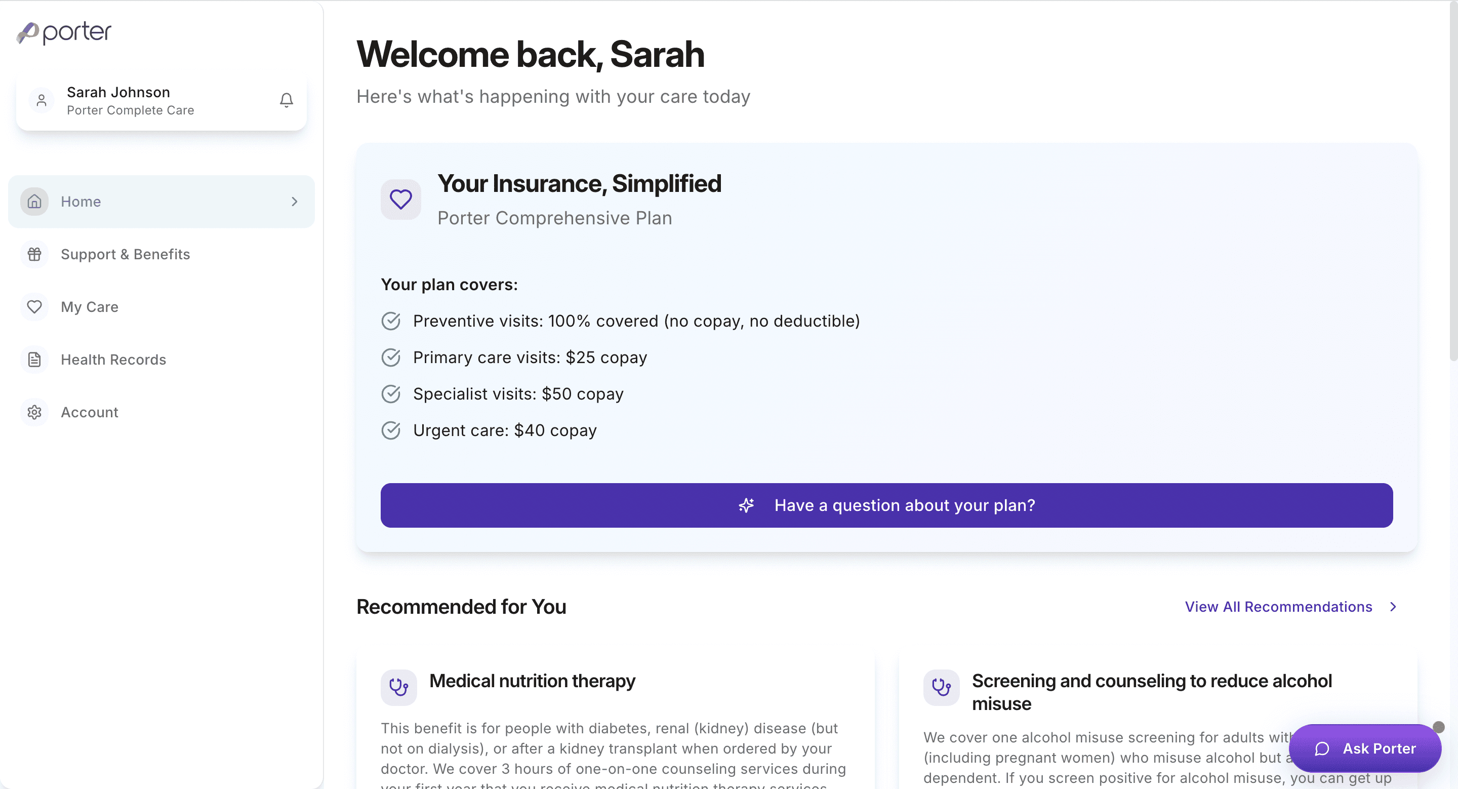
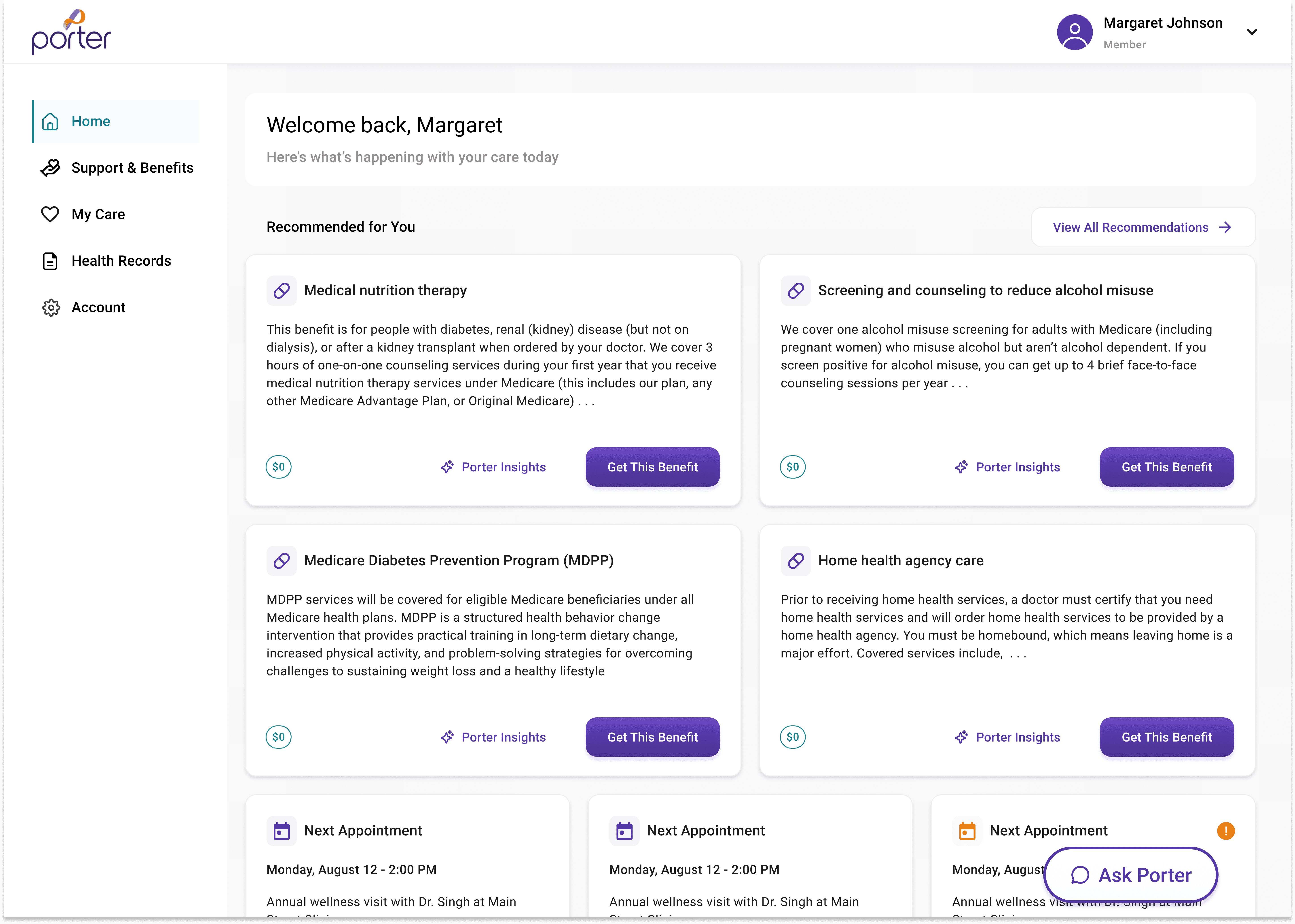
The redesigned dashboard serves as the member’s anchor point:
Simplified coverage summary
A single, predictable support pathway
Large touch targets and accessible, plain language
This created immediate orientation for older users.
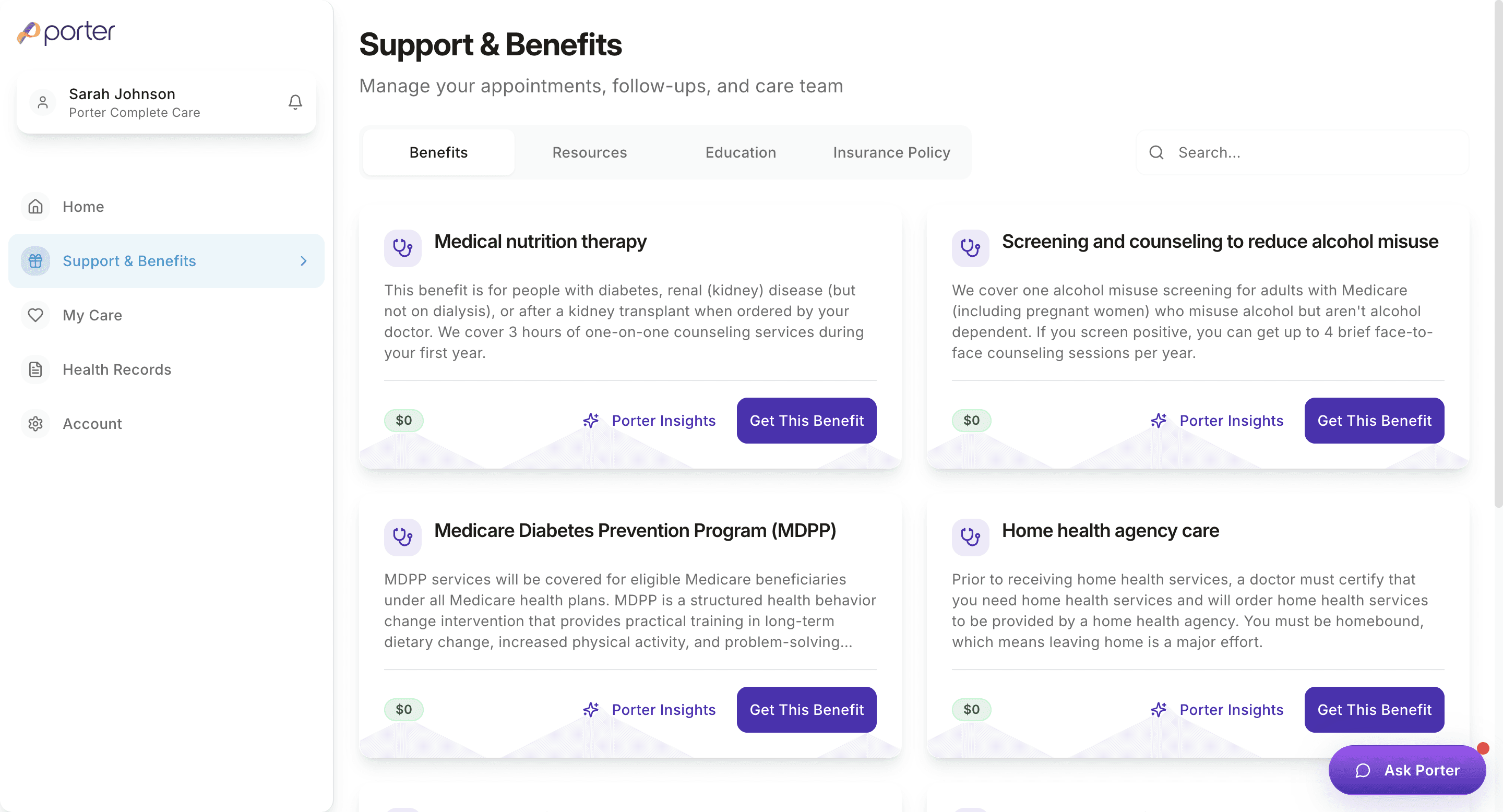
2. Make Porter Plan Outputs Easier to Find and Act On
The original portal already exposed some plan-related recommendations,
but they were spread across multiple sections with inconsistent labels. I consolidated and
renamed these areas so related information lived together and clearly pointed to what a member could do next.
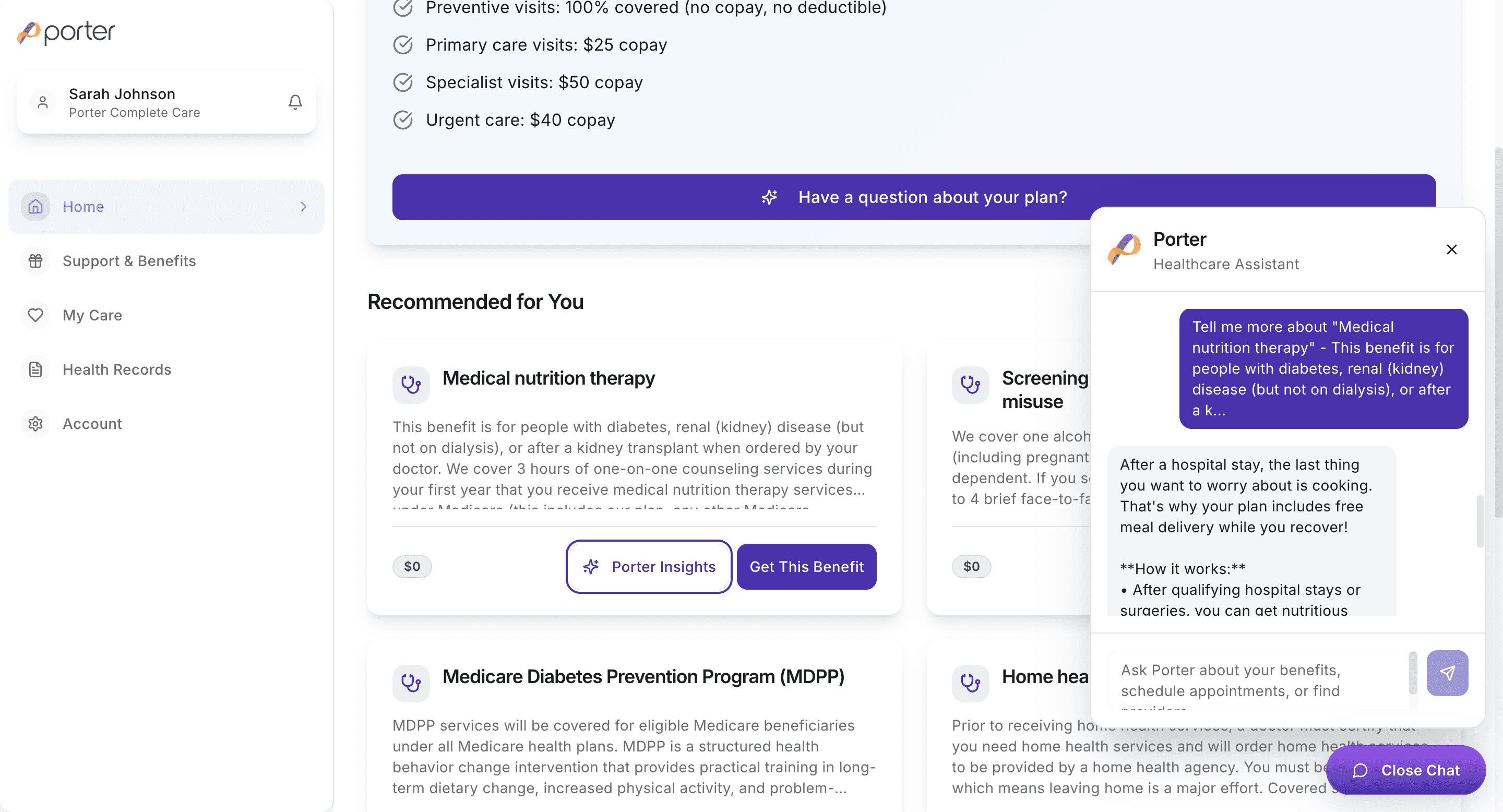
3. Use AI to Reduce Cognitive Load
AI was added only where it solved real user challenges:
translating insurance jargon into plain language
explaining the “why” behind tasks or services
helping users draft questions in Messages
4. Rebuild the Information Architecture
I consolidated redundant screens and rebuilt navigation around predictable, intent-based categories.
Results:
fewer top-level sections
clear hierarchy
no navigational loops
more teachable and consistent structure
5. Repair the Onboarding Flow Using Mixpanel Data
Mixpanel funnels revealed exactly where users were dropping off.
After redesigning the onboarding flow:
Onboarding conversion improved from 2% → 100%.
This was the single most impactful engagement improvement.
outcomes
Before redesign:
Only 2% onboarding completion
High support call volume for coverage questions
Low engagement with education and plan-related tasks
Fragmented user journey
Members unsure where to start
After redesign:
Onboarding completion increased to 100%
Plan insights were surfaced as resources, products, and services
Reduced care guide burden for coverage-related questions
Predictable, simplified Information Architecture
Experience aligned with operational workflows
AI introduced as a support layer
reflection
This project wasn’t really about changing screens. It was about fixing a system that didn’t give people a clear way forward.
Most of the work was figuring out what the portal was actually supposed to do for members, then organizing the experience around that. That meant cleaning up how information was grouped and named, simplifying things for older users, and making sure recommendations didn’t live in random places across the site.
A lot of the impact came from tightening the underlying structure — fixing onboarding using data, reducing navigational dead ends, and making plan-related guidance easier to find and act on. AI helped in a few key spots, mostly by making insurance and next steps easier to understand, not by adding new complexity.